
Key Takeaways
Every ecommerce brand hits the same three problems
Most DTC and ecommerce companies already run a marketing dashboard of some kind. Far fewer trust it enough to spend against without a second opinion, and the reasons repeat across brands consistently enough to name.
The first is reconciliation. Meta, Google, the store and the analytics property each report the same week differently, sometimes by 40% or more, because every platform grades its own work inside its own attribution window. Teams end up picking whichever figure supports the decision they were already leaning toward, then calling it data.
The second is treating revenue as the outcome. A campaign reporting 4x ROAS reads as a success right up to the point someone subtracts 30% in product cost, another 12% in shipping and payment fees, and the quarter of units that get returned on its top seller. Revenue is the one number in a business that says nothing about whether any of it was kept.
The third is the gap between the finding and the decision. Almost every marketing dashboard produces a conclusion and stops. Somebody reads it, opens Ads Manager, types a new budget, and the loop between measuring and acting runs through a person copying figures between two windows every Monday.
Consolidating six tabs into one marketing dashboard was a real problem, and the category solved it years ago. Any brand can have a clean, real-time view of spend by Friday for free. The harder problem is making that number mean something: reconciled across sources that disagree, net of what the order cost, and close enough to a decision that someone can act without opening another tab.
What follows ranks 10 marketing dashboards and reporting tools for 2026 on four things: where each gets its data, how far it carries the math, who it's built for, and which of them do anything with what they find.
What is a marketing dashboard?
A marketing dashboard is a single screen that pulls performance data from your ad platforms, store, email tool and analytics into one live view, so you can judge how marketing is doing without opening six tabs and reconciling them by hand. That definition is uncontroversial. What a dashboard is for is where the category splits.
Some exist to inform people who aren't in the tools daily: a founder, a board, a client. Those optimize for clarity, branding and a delivery schedule. Others exist to make an operator faster inside their own work, like a buyer checking whether Thursday's budget shift paid off. Those optimize for freshness and drill-down. Buying the wrong kind is the most common expensive mistake here, because in a demo they look identical.
What belongs on a marketing dashboard
A screen with 40 tiles is a screen nobody reads. The marketing dashboards people check every morning carry five to nine numbers, and the filter is worth applying literally: if a metric moving wouldn't change something you do this week, it belongs in a report.
For an ecommerce team, seven survive that test. MER, or blended ROAS, is total revenue over total ad spend, and it answers whether marketing as a whole pays for itself regardless of which platform claims credit. POAS asks the same question about money you keep, dividing contribution profit by ad spend. Both depend on contribution margin, or CM2: revenue minus COGS, shipping, payment fees, discounts and ad spend.
What belongs on a marketing dashboard
Then the acquisition group. CAC is acquisition spend over new customers, and it misleads alone, because a channel can post a flattering CAC while selling to people who would have bought anyway. New customer share corrects it, separating the channels growing you from those harvesting demand you created. CAC payback, CAC over monthly contribution profit per customer, sets how aggressively you can spend.
The seventh is the one nobody builds. Return rate by channel finds the campaigns quietly eating your margin, because a channel can look profitable while the product it pushes hardest comes back a quarter of the time.
Three of those are invisible to your ad platforms. Meta doesn't know your cost of goods, Google doesn't know your return rate, and neither knows the customer they just claimed bought twice last year. That gap is why digital marketing measurement tools exist separately from ad platform reporting.
It's also why "which campaign performed best" is harder than it looks. Campaign performance metrics tools that stop at clicks and revenue rank channels in an order that reverses once costs come out. Marketing efficiency tools worth paying for reach contribution margin first, then rank, and the best tools for marketing measurement do it per channel, campaign and SKU.
Marketing dashboard types, by who's reading
Most marketing dashboard examples online are organized by channel: a Google Ads dashboard, a Meta dashboard, an SEO dashboard. That's the wrong axis. Channel dashboards get built because the data is easy to pull, then nobody opens them, because no one's job is "Google Ads in isolation." Organize by reader and the metric set writes itself.
The executive view belongs to a founder, CMO or board, weekly, carrying MER, contribution margin, CAC payback and new customer share with nothing at campaign level. It's where most money gets misallocated, because a view assembled from each platform's own reporting shows Meta and Google both claiming the same conversions, with totals exceeding what the store recorded. Nobody catches it, because nobody reconciles a board deck against Shopify. The best digital marketing dashboard for an executive is the one whose revenue figure matches the store.
The paid media view is the opposite. Buyers need spend pacing, POAS, CPA, frequency and creative fatigue, refreshed hourly, with drill-down to the ad. Its failure is the missing profit column: a buyer scaling on revenue keeps feeding the campaign with the best ROAS and the worst margin. An ecommerce profit view runs daily for founders, finance and ops: CM2 by product, return rate, discount depth. Its characteristic failure is mundane, which is COGS entered once at setup and never updated. SEO views should lead with non-brand clicks and assisted revenue rather than traffic with no revenue attached. Lifecycle views cover repeat rate and cohort LTV, and usually get reported separately from acquisition, so blended CAC is never right.
Agency client reporting is its own category. Reporting tools for digital marketing get chosen on how the output looks, which is fair, since the client sees the report and never the pipeline. The problem surfaces when a client cross-checks a figure against their own admin and finds a gap you have to explain on a call. The best digital marketing reporting tools solve presentation and reconciliation, not just the first.
How we tested and scored each marketing dashboard
We scored every marketing dashboard on four criteria, weighted in this order.
Scoring draws on hands-on use, vendor documentation and verified reviews from G2, Capterra, Trustpilot and the Shopify App Store. Where a vendor's marketing and its behavior disagreed, we scored the behavior.
That's why several well-known dashboard reporting tools land mid-table: excellent on the first criterion, absent on the last two. If you're shopping specifically for the best marketing reporting tools rather than a decision layer, weight the list differently.
Quick comparison: best marketing dashboard tools (2026)
Admetrics
★4.8Best for: ecommerce and DTC brands that want a marketing dashboard priced in contribution margin, with budget controls on the same screen as the numbers.
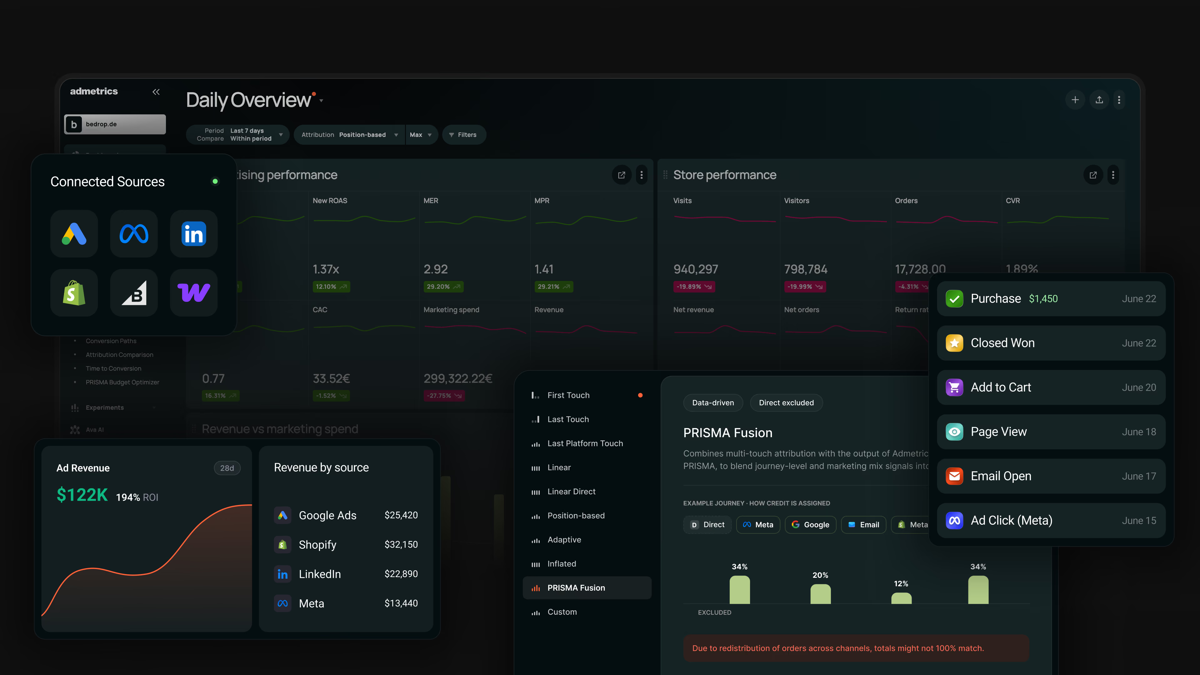
Admetrics presents as a dashboard, but the reporting layer sits on its own measurement: server-side tracking, multi-touch attribution, mix modeling and experiments resolve into one set of numbers, and 150+ KPIs render against that. Every channel gets graded by the same yardstick instead of by its own report card. Then the budget field is editable where you're looking at it.
Key features
Strengths
Limitations
Pricing
Billed against monthly ad spend rather than seats. Admetrics lists in euros, so the figures here are converted at roughly $1.16 to the euro. Growth is about $395 a month and covers $23,000 of monthly spend, charging 1.5% above it. Business is about $885 and covers $81,000 at 1% above. Custom starts near $1,275 from $116,000 at a negotiated rate. Six-month terms cut the base fee 7.5% and twelve months 15%. Every plan includes a 21-day trial with no card, and add-ons budget separately.Reviews
The review base is thinner than the incumbents here: 15 reviews on the Shopify App Store, all five stars, plus a handful on G2. What recurs is consistent, with reviewers crediting the tracking as reliable and spending most of the review on support that helps them interpret the numbers rather than on setup. One two-year customer called it a "very user-friendly and flexible dashboard".Bottom line
Every other dashboard here shows revenue and waits. Admetrics prices the same view in contribution margin and puts the budget field beside it. If you need to chart your warehouse or CRM, it's the wrong tool.Looker Studio
★4.5Best for: teams whose data already lives inside Google, who need a shareable marketing dashboard this week and have no budget for reporting software.
It costs nothing, connects to GA4 and Google Ads in two clicks, and shares like a Google Doc. The friction starts at the edge of Google's ecosystem, where every other source becomes a paid connector and a performance problem.
Key features
Strengths
Limitations
Pricing
Free with no functional expiry. Pro is $9 per user per month annually, charged per Google Cloud project, so ten people across three client projects is thirty seats. The real costs sit outside the subscription, in third-party connectors and BigQuery processing.Reviews
Gartner Peer Insights carries 423 ratings at 4.5, the deepest sample in its category. Reviewers praise two things and rarely a third: the price, and how little resistance Google sources put up. One reviewer pairs the standard complaints exactly: "It can be slow with large datasets, and some advanced customizations are limited."Bottom line
Keep it. For Google-channel reporting on no budget it's still the right first answer. Just know you're running a visualization layer that inherits Google's view of your performance and has no opinion about whether a campaign made money.Tableau
★4.4Best for: organizations with an analyst or BI team, where marketing sits in the same model as finance, ops and product data.
Tableau is the visualization ceiling here. If you can describe a chart, someone with a Creator license can build it. What it isn't is a marketing tool. It starts from a clean, modeled dataset, and getting your ad platforms into that shape is a separate project with a separate vendor.
Key features
Strengths
Limitations
Pricing
Per user, annual only. On Cloud Standard: Viewer $15, Explorer $42, Creator $75 a month; Enterprise runs roughly $35, $70 and $115. Tableau+, which carries the AI layer, is quote-only. No deployment works without a Creator, so $900 a year is the floor.Reviews
Roughly 4.4 across more than 2,000 G2 reviews, and almost nobody disputes the output quality. The criticism arrives in the same order every time, learning curve then cost then performance, with one reviewer calling it "a little pricey, since the switch to salesforce."Bottom line
Buy Tableau when marketing is one slice of a company-wide analytics problem and someone's job is running it, not as a marketing dashboard in its own right. Once you've paid for connectors, a warehouse and a Creator seat, you've built the expensive version of what a purpose-built tool does on day one.Power BI
★4.5Best for: companies standardized on Microsoft, where finance lives in Excel and a $14 seat price settles the argument.
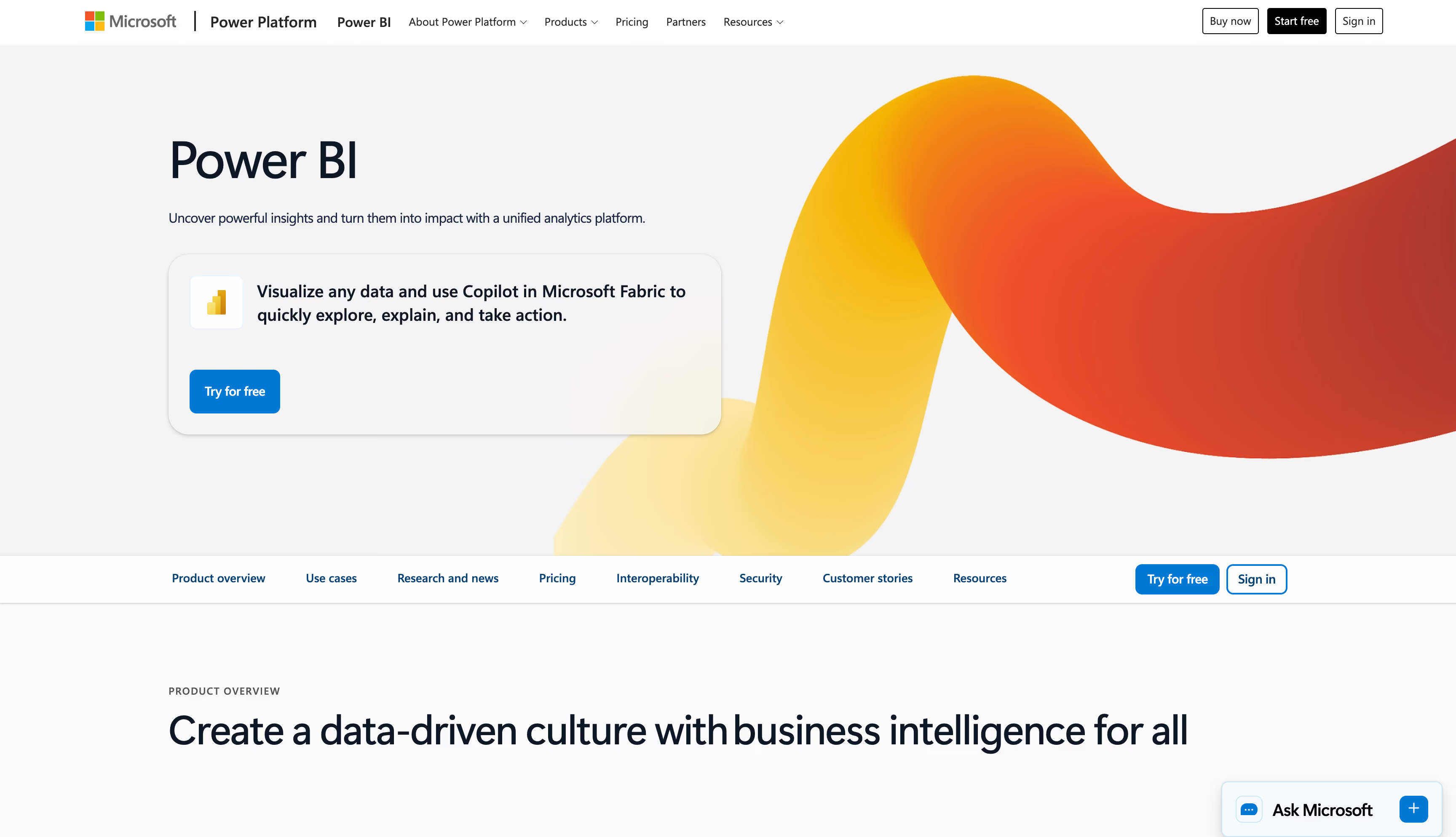
Power BI is the cheapest serious BI platform on the market, and many companies already pay for it inside an existing Microsoft 365 agreement. The modeling depth is real, and so is the wall you hit reaching it, because it expects clean data and someone who knows DAX.
Key features
Strengths
Limitations
Pricing
Desktop is free but cannot share. Pro is $14 per user per month annually and Premium Per User is $24, both raised from $10 and $20 in April 2025, so older guides understate it. Fabric capacity runs from about $263 a month to $5,000 at F64, where viewers stop needing licenses.Reviews
4.5 across more than 1,500 G2 reviews, praised for Microsoft integration and value. The criticism is tallied and the order doesn't move, with learning curve and DAX far ahead of everything else. One review compresses it: "Steep learning curve for DAX, slow performance with large datasets."Bottom line
If your company runs on Microsoft and someone can write DAX, this is the best value in BI. As a marketing dashboard it carries Tableau's gap at a lower price: you supply everything that makes it a marketing tool, and it still reports revenue rather than profit.Databox
★4.4Best for: small teams and agencies that need a working marketing dashboard by Friday and no appetite for building a data stack.
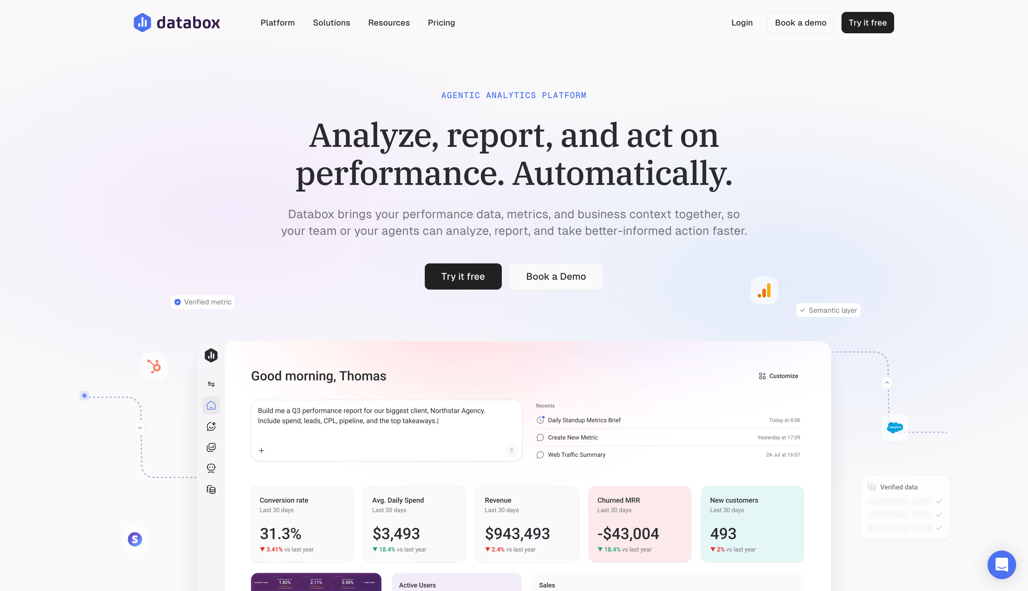
Connect a few accounts, pick a template, and something readable is on screen inside an hour. This is a monitoring tool, not a diagnostic one: good at telling you a number moved, weaker on why, silent on what it cost.
Key features
Strengths
Limitations
Pricing
Billed by data source rather than seat, with unlimited users. The entry paid tier runs around $159 a month annually with three sources, extra sources roughly $5.60 each. Higher tiers run near $399 and $799, and the free plan has been repackaged more than once, so confirm directly.Reviews
4.4 across roughly 194 G2 reviews, over 70% from small businesses. Praise centers on speed and client-readiness; complaints cluster on editing lag and layout one reviewer found not "as flexible as Canva or traditional slides".Bottom line
Right for a lean team or agency that needs many readable dashboards fast and cares more about tracking targets than interrogating them. Price per-source billing against your real stack first, because it lands well above the headline.Improvado
★4.4Best for: mid-market and enterprise teams with 15 or more data sources, where the reporting problem is really an ingestion problem.
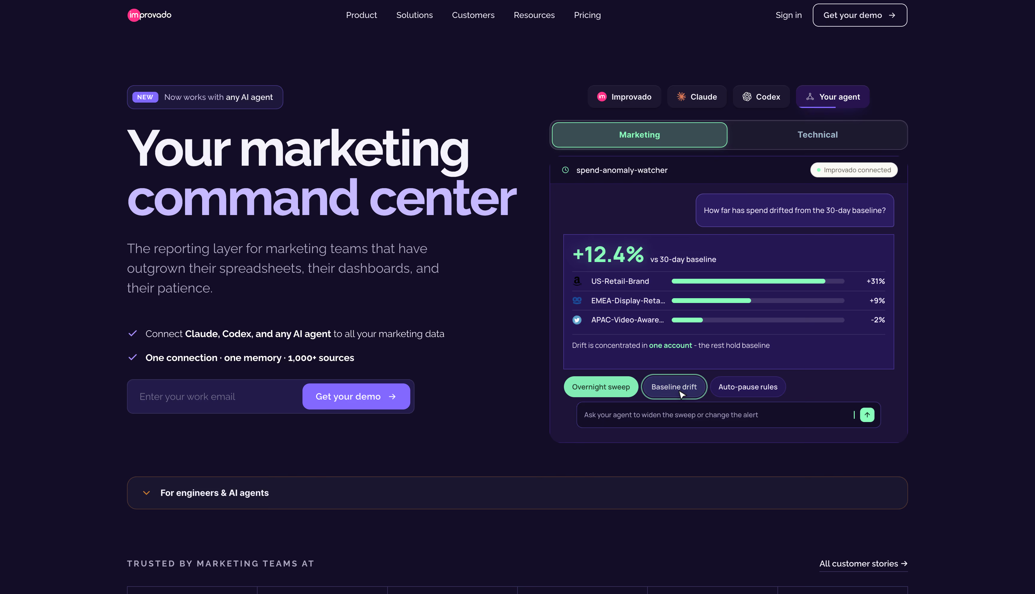
Improvado holds the top organic result for this keyword, which matters before you evaluate it, because the product isn't what the query implies. It's a marketing data pipeline with a governance layer. Aligning naming, currencies and metric definitions across 30 platforms is the unglamorous work that decides whether anything downstream can be trusted.
Key features
Strengths
Limitations
Pricing
Nothing published. Three tiers quoted against data volume and connector count, with custom connectors and advanced modules drawing on a credit allowance. Expect a demo, a scoping call and a quote in thousands per month.Reviews
4.4 across 80 G2 reviews, nearly half mid-market. The praise is uniform: data arrives reliably as advertised, and named CSMs recur. The criticism is setup complexity and cost, with one reviewer putting it plainly: "The price tag is high, especially for smaller organizations."Bottom line
If your reporting is broken because 30 platforms disagree about what a campaign is called, Improvado fixes the actual problem. Just be clear you're buying plumbing, not answers. It delivers clean, reconciled revenue to any dashboard, none of it net of what the products cost you.Funnel
★4.5Best for: marketing and data teams pulling spend from a long tail of platforms into a warehouse or BI tool, with the reporting layer decided.
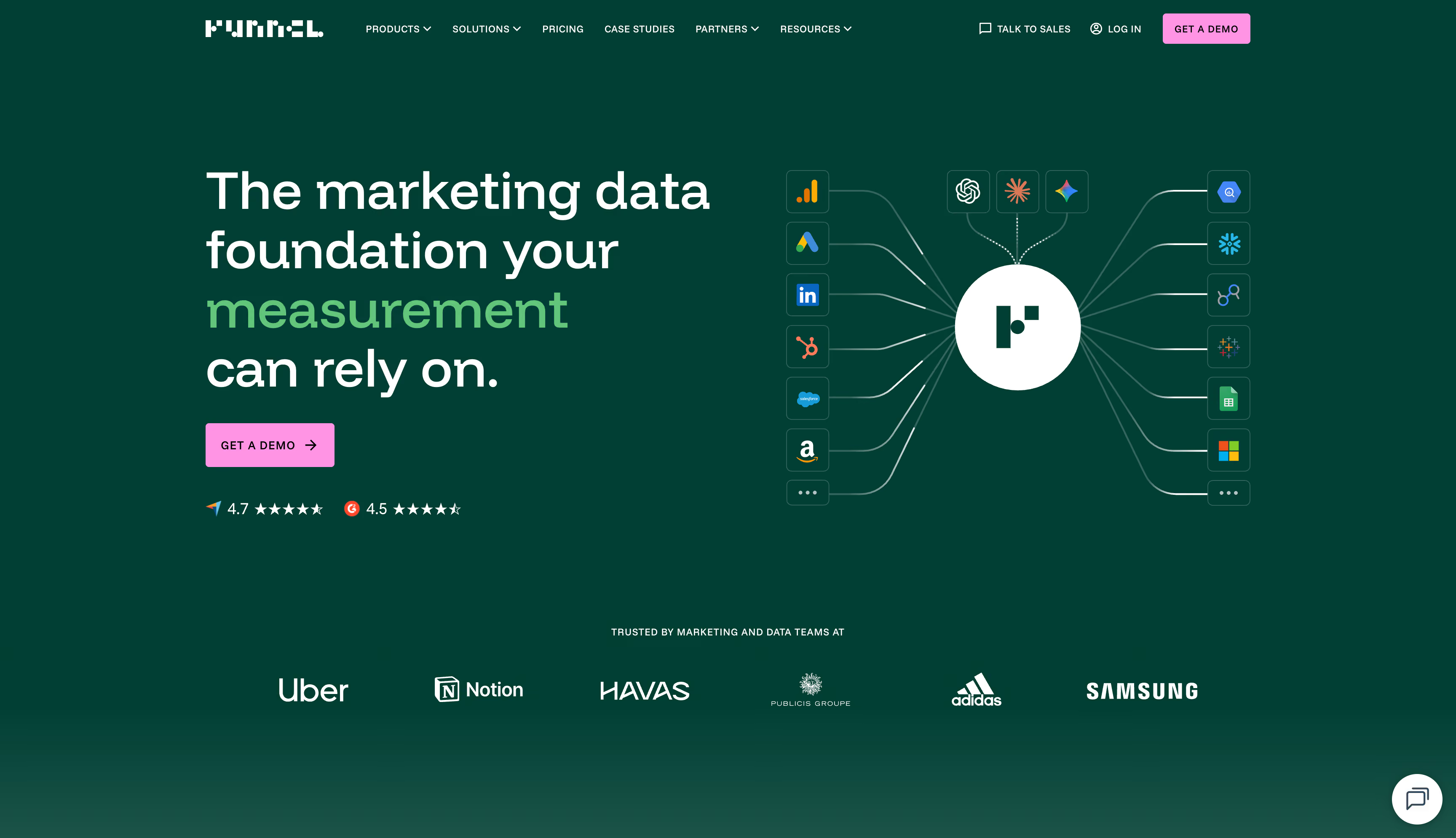
Funnel is a marketing data hub that grew a measurement arm. It comes closer to real measurement than anything else here, running mix modeling and incrementality and pushing conversion signal back to the ad platforms. The catch is that almost none of that is in the price you first hear.
Key features
Strengths
Limitations
Pricing
Business is listed from around $600 a month billed annually with the full connector library. Starter sits below, Enterprise is custom. The tier only sets the floor, because flexpoints set the real cost, and prices moved several times in early 2026.Reviews
4.5 across roughly 164 G2 reviews and 4.7 on Capterra. The praise is operational: it centralizes everything and the mappings hold. The criticism is never about whether it works, only what it costs, with one reviewer calling flexpoints "the bane of my existence."Bottom line
Buy Funnel to solve ingestion, which it does about as well as anyone. It is plumbing rather than a marketing dashboard, so budget for the reporting layer on top, expect the metered bill to exceed the tier price, and look elsewhere if margin is the number you came for.Triple Whale
★4.5Best for: Shopify DTC brands wanting spend, revenue and margin in one dashboard without building anything.
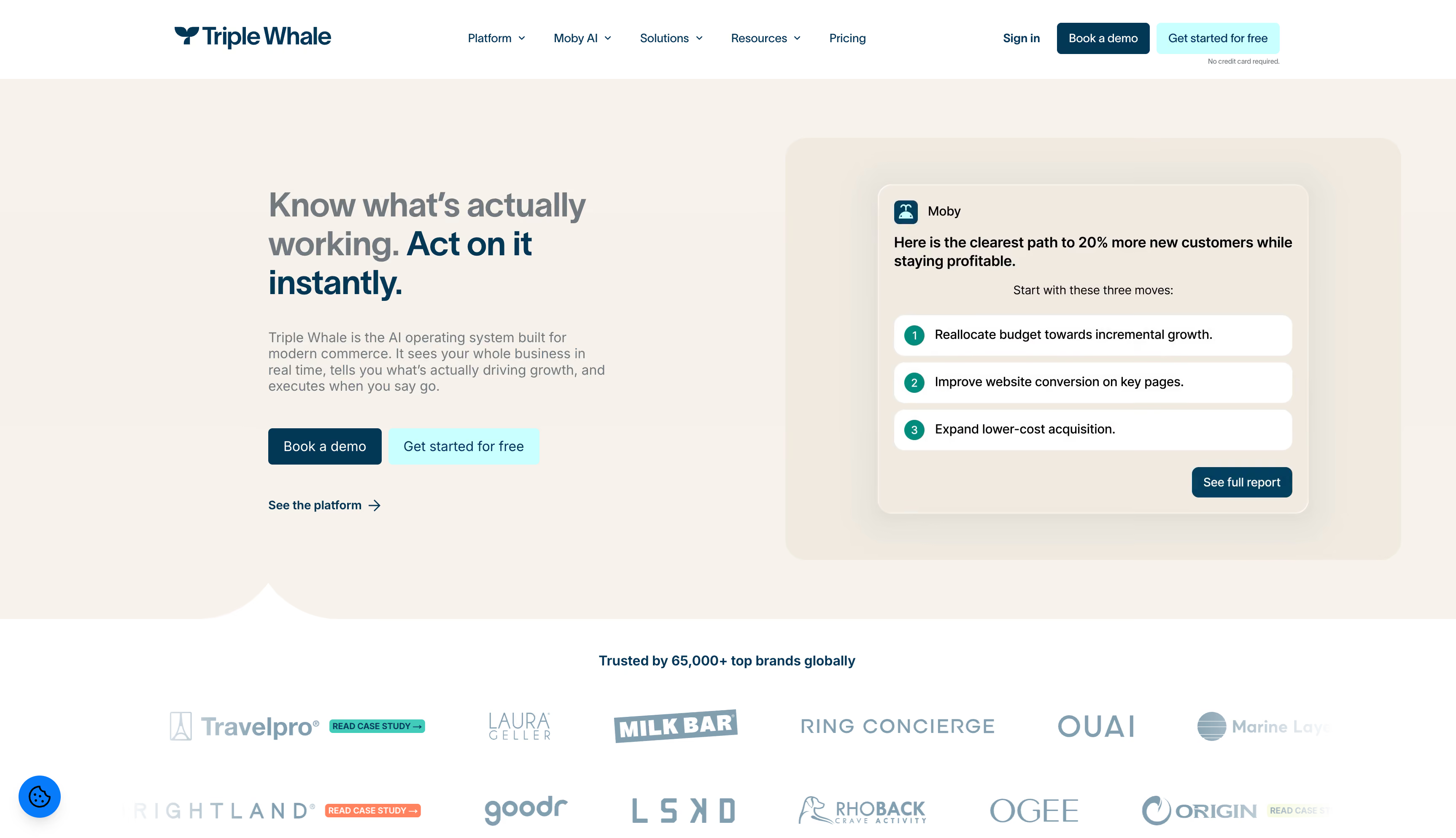
For many DTC operators, Triple Whale is what "marketing dashboard" means. The free tier is good enough that many never leave it, and what started as a ROAS tracker now ships agents that adjust budgets and pause ad sets. The dashboard grew hands. What it hasn't grown is a full P&L.
Key features
Strengths
Limitations
Pricing
A genuinely usable free plan covers Triple Pixel tracking, first and last-click attribution and Moby chat. Paid tiers were restructured more than once through 2026 and land between roughly $130 and $300 a month, with a 12-month commitment. Compass and Data Warehouse Sync are quoted separately.Reviews
The ratings split by platform: G2 sits at 4.5 across roughly 479 reviews, Trustpilot near 2.8, and the Shopify App Store is bimodal at 79% five-star and 16% one-star. The low scores are rarely about the interface, clustering on billing, contracts and numbers needing manual checks.Bottom line
For a Shopify brand that wants a capable dashboard today and an agent that acts on it, it remains the default. Just know the profit number stops at gross margin, so it won't show which campaigns your returns are eating, and read the contract more carefully than the demo.Whatagraph
★4.5Best for: agencies and in-house teams whose job is producing branded, repeatable reports for people outside marketing.
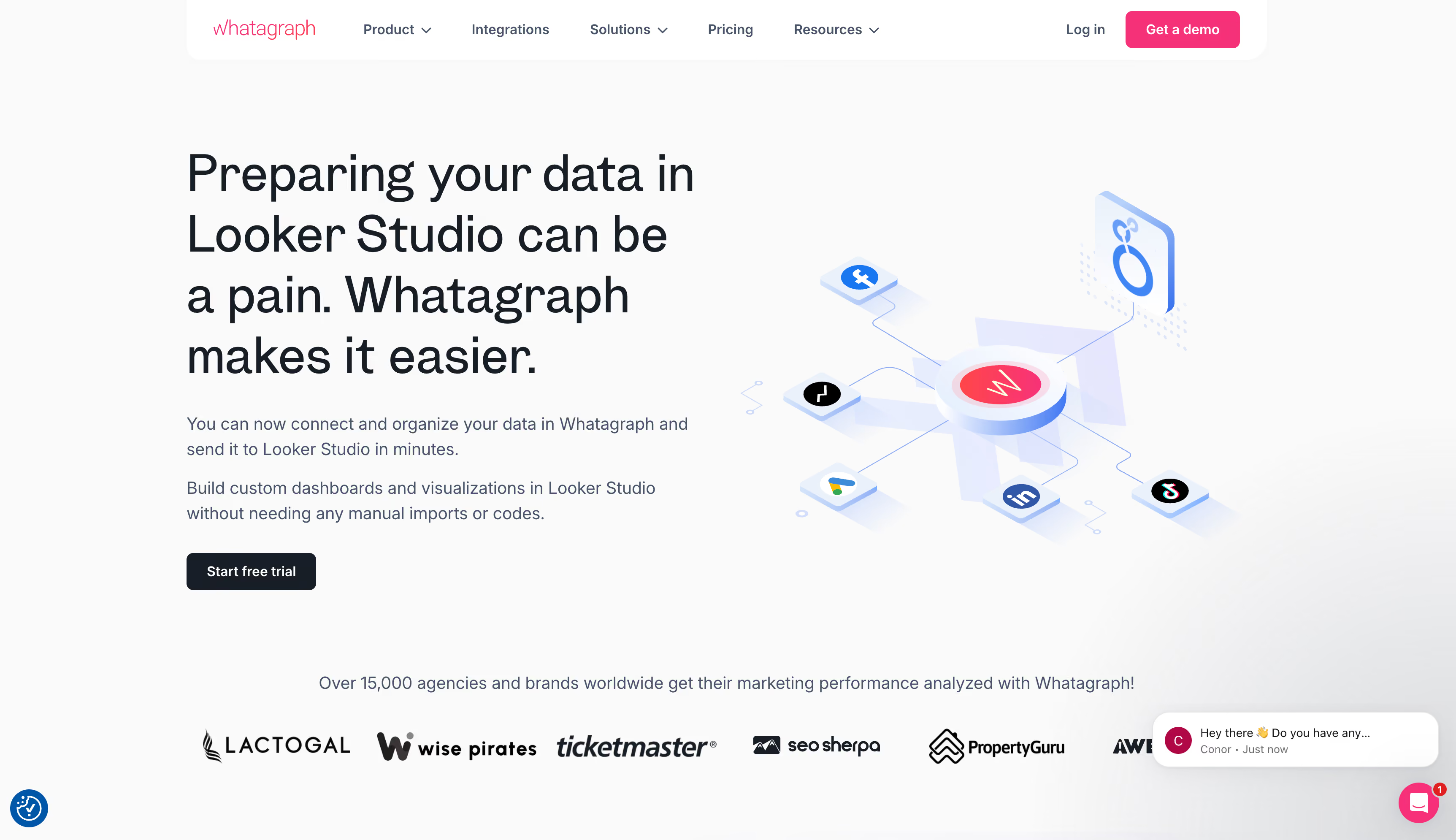
Whatagraph produces the best-looking output on this list. Reports look designed rather than exported, carry your branding, and reach clients on schedule without anyone assembling them. This is a presentation layer and it's honest about being one.
Key features
Strengths
Limitations
Pricing
Two plans priced on source credits, one per connected account, so a client on GA4, Google Ads and Meta uses three. Max is the only published tier, from roughly €699 to $812 a month billed annually, with no monthly option.Reviews
4.5 across roughly 277 G2 reviews and 4.4 on Capterra. Praise is repetitive: speed to a polished branded report, linked templates, the success manager. Cost is the sharpest criticism, from happy customers as often as unhappy ones.Bottom line
Buy Whatagraph if the report is the product. Don't buy it as an ecommerce marketing dashboard. It shows your platform-reported ROAS beautifully, in your brand colors, and never mentions that the campaign at the top of the chart is losing money.Klipfolio
★4.5Best for: teams with a technical person and an unusual data source, who want pixel-level control over a marketing dashboard and are willing to build it.
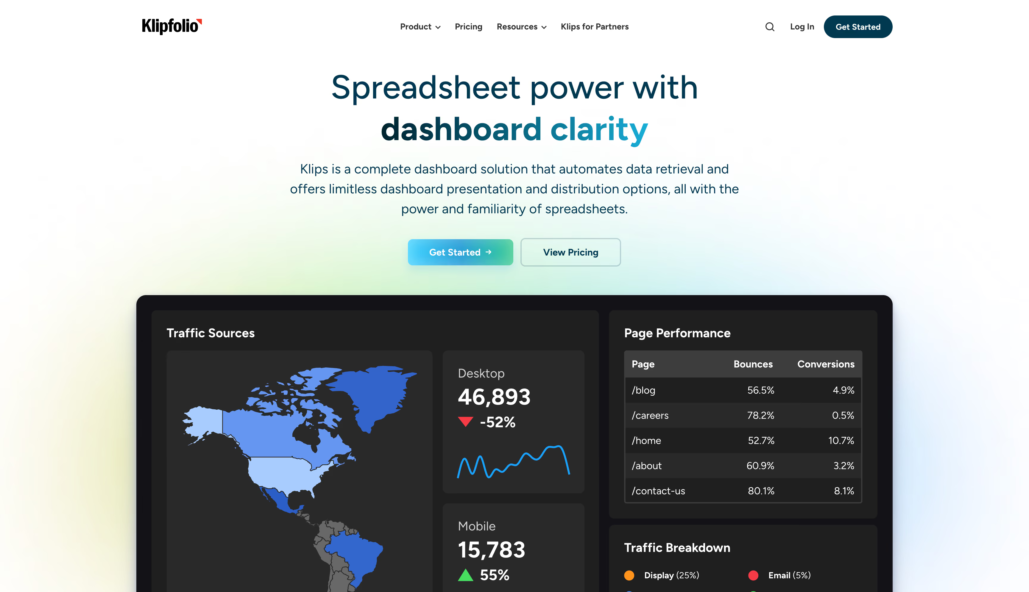
Where most tools hand you a template and a fixed connector list, Klipfolio hands you a formula layer, a REST API connector and a blank canvas. If a platform has an API, you can chart it. The cost is time, and reviewers are unanimous about it.
Key features
Strengths
Limitations
Pricing
Klips meters dashboards with unlimited users: roughly $90 to $140 a month annually for three, about $8 per extra, rising to near $900 at the top. White-labeling is a separate $299. PowerMetrics is per user at roughly $18 to $30, two-seat minimum.Reviews
4.5 across roughly 256 G2 reviews, about 55% small business. Connector flexibility and support speed dominate the praise; the criticism is one theme, which is build time. One Capterra reviewer called the backend "very daunting for someone who isn't very familiar with large datasets and coding."Bottom line
The right answer when you have a data source nothing else supports and someone who enjoys building. For an ecommerce team, you'd spend weeks hand-building the profit view purpose-built tools ship on day one.The best marketing dashboards for 2026: final verdict
Accuracy is not what separates these ten. Most of them report something defensible. What separates them is how much of the distance they cover between a figure appearing on screen and money moving in an ad account, and most stop well short of the far end.
Admetrics covers the most of it. For an ecommerce brand it owns every layer rather than borrowing one: capture that holds up under consent loss, consistent credit across channels, costs subtracted down to variant, and an editable budget sitting next to the figure that argued for the change.
The alternatives earn their places for narrower jobs. Looker Studio is still the right free answer for Google-channel reporting. Tableau and Power BI are correct when marketing is one slice of a company-wide analytics problem and you have an analyst. Databox gets a lean team a scoreboard by Friday. Improvado and Funnel fix ingestion where 30 platforms disagree about what a campaign is called. Triple Whale is the DTC default, as long as you know its profit view stops at gross margin. Whatagraph is the best output here if the report is what you sell.
Match the tool to the job and none is wasted. But if you sell physical products and paid media is your biggest line item, only a couple of these change which campaign you'd scale on Monday. Run a trial against live data and watch whether the profit view reorders your winners.