Part II: Segmented for success
Let's start with a quick summary from the previous post:
- ROAS is the gold standard when it comes to evaluating user cohort acquisition
- short-term ROAS (3 days up to 3 weeks, depending on industry and channel) is often a useful proxy for the true long-term ROAS over a customer’s lifetime (or at least 3 months)
- ROAS is 100% * ARPU / CPI, or revenue divided by spend. Both components can vary independently, the challenge is to optimize these at the scale of the business
ROAS optimisation
So how can we manage and optimize ROAS for the users that we acquire? There are three main levers we can operate:
- creative: what message are we sending to users
- targeting: which users are we sending our message to
- channel: where are we even trying to reach our potential users
For many advertisers, focusing on one channel will deliver the best results, while for large advertisers a meta-optimization arises to saturate multiple channels adequately. We focus on the creative and targeting.
Two phases of user acqusition
We can distinguish between two phases of user acquisition:
- initial acquisition: convincing a user to perform an initial interaction with the product at least once (for example, install and open app once). This is mostly a function of the creative (and potentially the landing page), with some input from targeting.
- early retention and monetization: convincing a user to learn and use the product. This is mostly a function of targeting (and product quality), with some input from the creative.
Historically, simple metrics like click rates and install rates were used to optimize for initial acquisition. Unfortunately, they are quite hackable, ripe for abuse, and often not correlated with long-term ROAS, therefore we focus on the early retention and monetization, measured with short-term ROAS.
So we continue to put the user first, and start with splitting our cohorts by dimensions, thereby creating cohort segments that can be compared. Examples of such dimensions are:
- channel specific settings, such as campaign, ad set and ad for Facebook
- demographics of the user, such as geography
- platform, such as desktop vs iOS vs Android
For instance, within a particular campaign, we can compare the performance of different targetting settings. For each cohort, we split users according to which targeting they converted from, we call these segments of the cohort. There are two main questions to answer:
- Which segment performs best in terms of short-term ROAS?
- Which segments are gaining or losing in performance, compared to the corresponding segment of previous cohorts?
To optimize our campaigns, we want to allocate budget from the worse to the better performing segments. This means that the dimensions we pick to segment need to be actionable.
Case study
Let's have a look at some real, anonymized data.
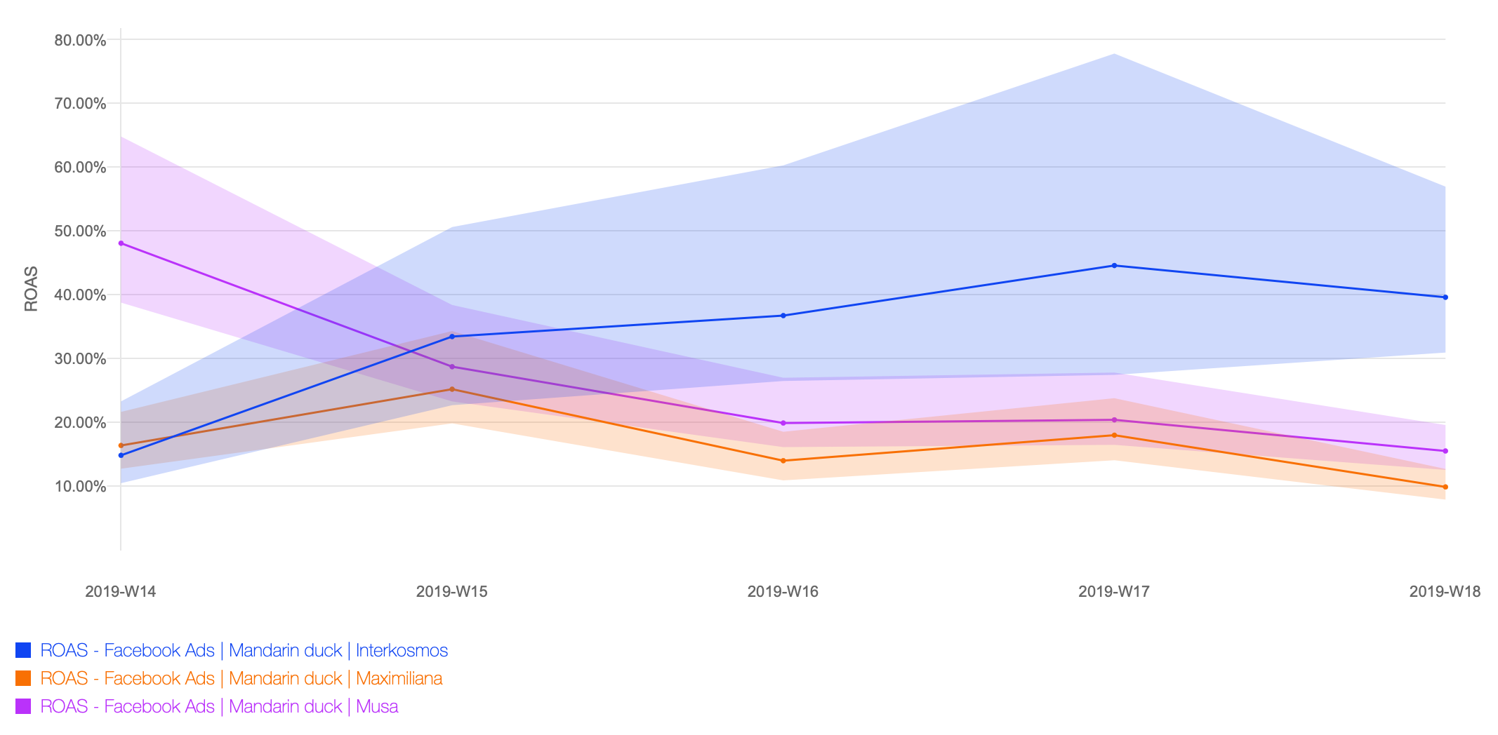
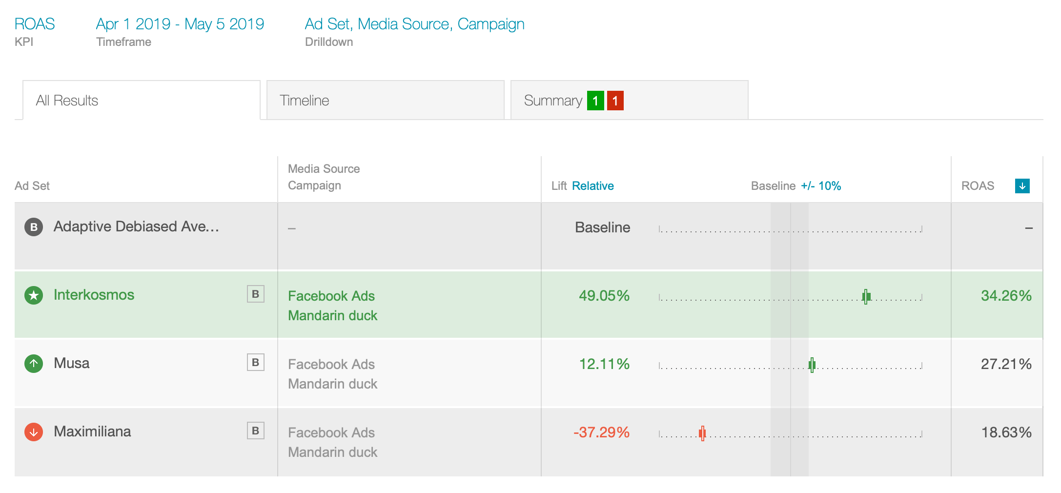
Explanations are in order: Charted is the 7-day ROAS for five consecutive weekly cohorts (the weeks of April 2019) for four Facebook ad sets (targeting settings) that happened to be running for a particular campaign Mandarin duck.
Recall from our previous blog post that this early ROAS by segment is assumed to be strongly correlated with the long-term performance of cohort segments, and used as a proxy. The question we are trying to answer is which targeting settings are particularly effective and acquiring profitable uses, and how the dynamic of each ad sets performance evolves over time.
One ad set Maximiliana (orange) consistently performs at around 20% ROAS. Some weekly variation in cohort performance is of course to be expected, and by squinting we see that this ad set’s performance variation is roughly within the same range (same width) as its credible interval.
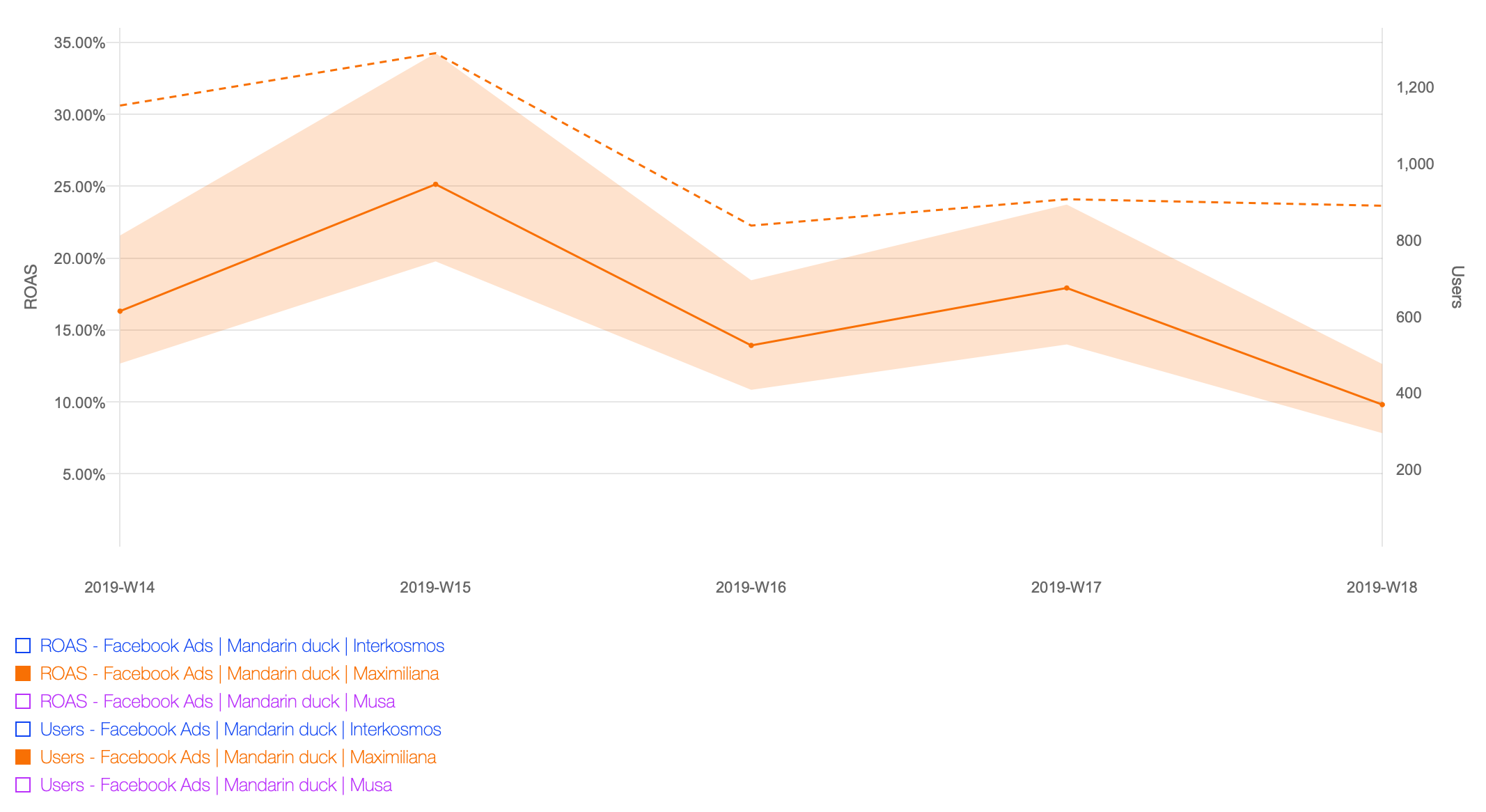
Charting only Maximiliana, and adding cohort size as an additional metric confirms this is a relatively stable, albeit mediocre performing ad set. So if we were happy with this ad set at the beginning of April (we may have business reasons to target this segment despite non-stellar performance), we have no reason to change our opinion by the end of April:
The other two ad sets however have strong performance trends over this period:
Ad set Musa performed well at the beginning of the month (50% ROAS), dropping to Maximiliana performance levels of 20% ROAS. By contrast, Interkosmos consistently improved its performance throughout the month, moving from 20% to 30% to three consecutive weeks of around 40% ROAS.
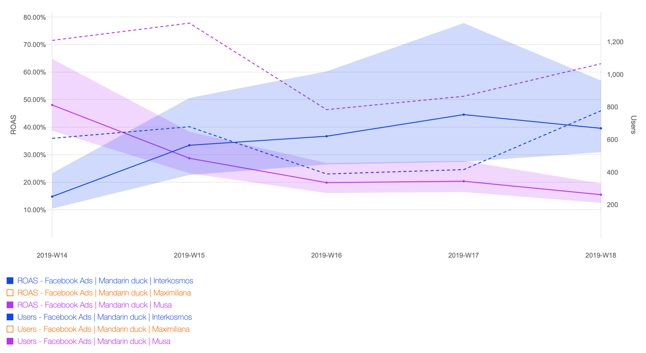
Most unfortunately, the number of users acquired via Interkosmos went down in weeks three and four, until spend was increased in the fifth week. This smaller sample size explains the widening of its 95% credible interval over time. Even so, for the three final weeks the entire credible interval lies above the deteriorating Musa and consistently mediocre Maximiliana: it performs twice as well!
We would be well advised to increase budget allocation towards Interkosmos, at the expense of the two others. While such an increase in spend on a targeting setting may increase the cost per acquisition, the huge performance margin over the others will act as a buffer on such (possible but not automatic) increases in acquisition cost.
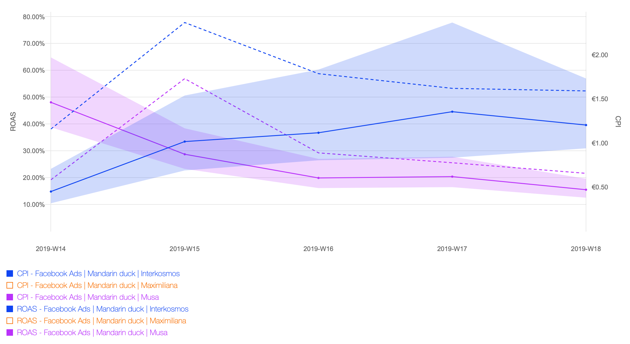
For illustration, we end this example with a chart that plots the CPI: It reveals that Interkosmos is indeed already pricier compared to its competitor, yet tapping into this “premium” segment is the right choice due to its vastly superior revenue generated.
By comparing these two ad sets over the entire month, we have a more concise picture showing lifts including credible intervals for the difference in performance:
Digging deeper
ROAS is the gold standard of bottom line financial metrics. To understand how (and maybe why) certain segments perform better than others, we can dig deeper by comparing additional metrics, which focus on constituent parts of ROAS. Here are some examples:
- Churn % (or Retention %): the flattening out of ROAS curves is due to user churn (less engagement, or complete abandonment). Only early churn is in the domain of user acquisition, and comparing it across segments can lead to “stickier” cohorts. Keeping users is always cheaper than acquiring new, so keep an eye on this one. More specifically high churn values on day 1 may indicate great creative paired with bad targeting, leading users to install the app, only to abandon it immediately because it is a bad fit. On the other hand high churn rates on day 7 may indicate bad user onboarding.
- ARPU and CPI: Typically (but not always), there’s an inverse relationship between ARPU and CPI. Wider targeting and generally cheaper channels vs high-quality users. Use ROAS to compare segments, but break down into ARPU and CPI to understand the tradeoffs.
- Paying Users %: since paying users contribute on the order of 10X+ in revenue, keeping a healthy ratio of paying users among all acquired users is an imperative. The only exception being awareness campaigns (or attempts to reach virality, dolphins, etc.). To make this abstract metric more understandable, track your customer acquisition cost, which is the spend per paying user: CAC = CPI / PU%.
As alluded to in this blog about exploratory experimentation, performing an exhaustive analysis by comparing all these possible combinations is quite the chore. Our current work in Newton is focused on implementing augmented analytics, towards automatically spotting opportunities and pro-actively making recommendations.